Another year, another NFL team going through a rebrand. How exciting! These teams will endlessly reiterate, revise, renew, and redesign perfectly good uniforms just to sell more jerseys and merch to us sucker fans.
But maybe, this time, the Tennessee Titans (a completely irrelevant franchise with no hopes of ever winning a Super Bowl) could at least look good while losing. At least.
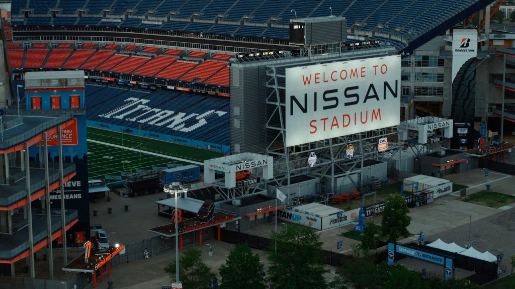
Okay, first we need to look at their old, stinky unis and logo.
They mix dark blue with light baby blue, white, and sometimes red and/or black. The flames coming off the logo have been around since the ’90s, and the whole thing is a mess. It’s just too much and, somehow, too little at the same time. It isn’t memorable, flashy, good looking, attractive, nor intimidating.
So now let’s look at the new ones… Are they an improvement?
Yeah, I would say so! They definitely took a page out of the recent LA Chargers pivot to baby blue and vibrant color schemes as opposed to the dark and brooding ones.
The logo is better — cleaner. It’s not that different, there’s still a T with some stars inside of a circle, but the overall uniform is much simpler and straightforward. A real “stars and stripes” on the white uniforms — especially the shoulders. It’s harder to see on the all blue ones.
Overall, I would give the white ones a B and the blue ones a B-. I really think that when players accentuate the shoes and shooting sleeves with red, it makes it pop brighter.
It’s like they’re throwing back to retro jerseys that never existed for the Titans. Well, the Houston Oilers had things that looked like these, but this rebrand reminds me of the recent Jets throwback jerseys they brought back.
Oh, yeah, they definitely had some inspiration for the baby blue: The Earl Campbell days. Too bad those teams sucked and never won anything either. This Titans team has no direction, no identity, no team, and ownership that fires Mike Vrabel and hires Robert Saleh.
They got a quarterback and literally nothing else to surround him on either side of the ball. They will be bad for a long time to come, and never turn it around unless Cam Ward turns out to be the second coming of Patrick Mahomes; which he won’t.
At least Titans games will be looking nice now. Unfortunately, I won’t be tuning in because I will be drafting zero players in fantasy, so I won’t have any reason to turn on a Titans game.
Image Credit: Isaac Macdonald


Leave a Reply